
Redesigned The Foodie App’s Explore Page to Find Restaurants Faster
Role
UI design, UX design
Timeline
June 2021
Platform
Website

About Project
This was a challenge of the design competition, where we hunted for UX issues and provided design solutions to fix them. The target of this challenge is a foodie application, where users can book a table or place an order at their local restaurant. The challenge's goal is to improve the ordering flow on their website.
DEFINING THE PROBLEMS
What is the issues?
The discovery section isn't discovering.
Users struggle to discover meal options that fit their preferences, often browsing aimlessly for inspiration. This increases the time and frustration of ordering lunch.
The current order flow is really funky and clunky.
The order flow is inefficient and unintuitive. Setting up delivery information requires users to navigate back to the homepage and restart the process, leading to frustration. The no-result journey also lacks clarity or alternative solutions.
Lack of Information.
The platform lacks critical content that users need to make informed decisions, such as restaurant reviews, value-for-money insights, or visible deals. This leaves users uncertain about their choices.
RESEARCH AND FINDINGS
Beyond just the guesswork
Usability testing
I conducted usability testing with three participants to validate my assumptions. The goal was to understand how they interact with the website and perceive its features. The participants were individuals who frequently order food delivery, averaging at least once per week.

Image: Usability testing
Benchmarking the Best (and the Rest)
I also learn about other food delivery platforms. The purpose is to gain a fair amount of knowledge of current user behavior, flow, and content. I collected a lot of interesting insights from them.
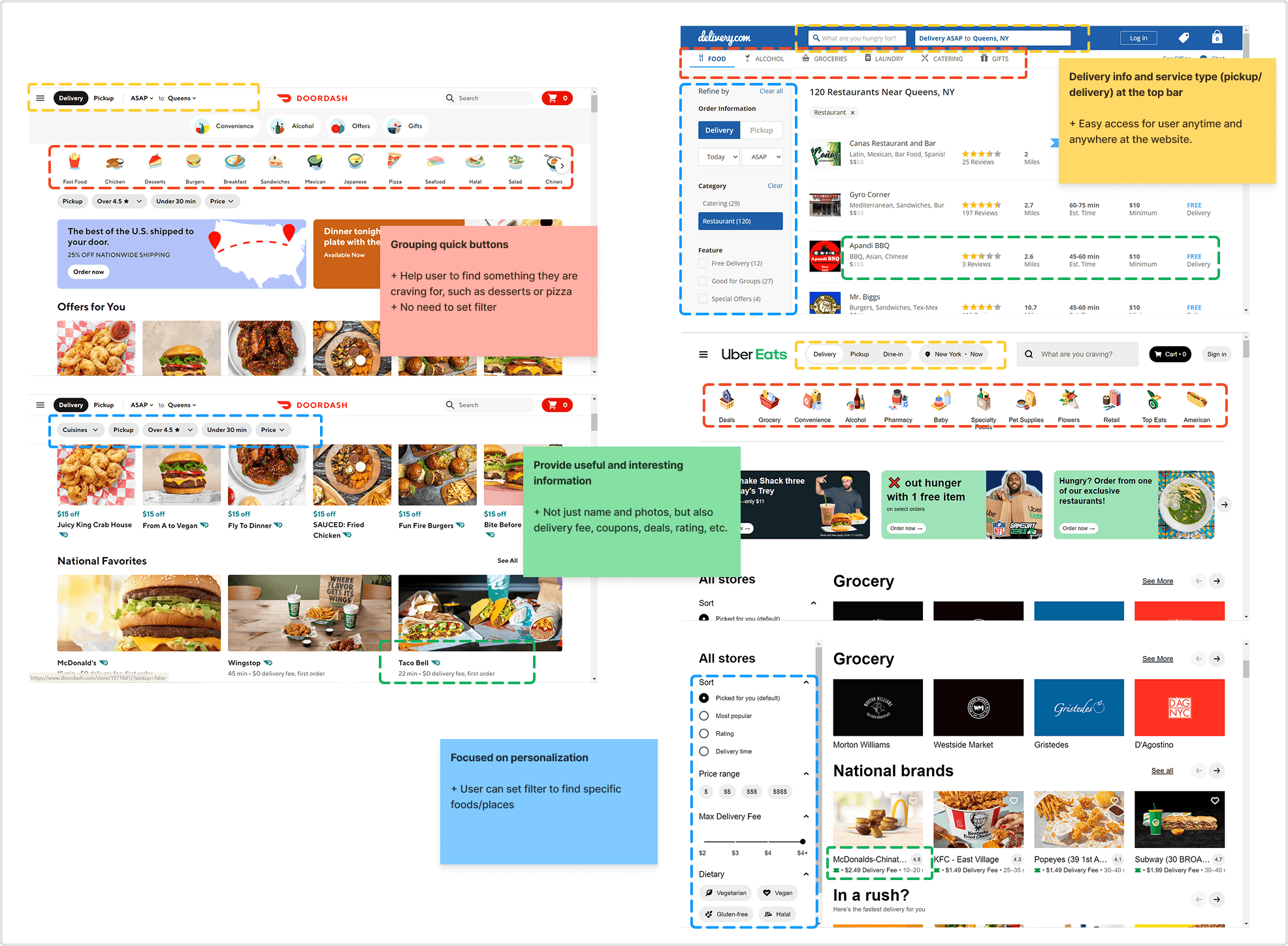
Image: Result from desk research
CHALLENGES
The real issues are more than just ordering flow
Pain Point 1: Order Info
Users found the order setup process to be inefficient and confusing. Currently, they can only configure order details on the Explore page, and changing the order information requires them to return and restart the process.
Additionally, the filter beside the search bar was unclear to some.
Pain Point 2: Discovery of Foods and Restaurants
The Explore page overwhelmed users with too many untailored options. They wanted curated recommendations that matched their preferences. Also, additional details like discounts, promotions, ratings, and delivery time allow them to differentiate the item that is worth clicking on and guide their decisions.
Pain Point 3: Empty Search Page
When the user typed an uncommon food name on the search bar and was directed to the no-result page with blank content.
The absence of alternative suggestions or feedback left them frustrated and disengaged, as they were unable to continue their exploration meaningfully.
DESIGN EXPLORATION
Designing the smooth experience from the start
Users found the order setup process to be inefficient and confusing. Currently, they can only configure order details on the Explore page, and changing the order information requires them to return and restart the process.
Additionally, the filter beside the search bar was unclear to some.

Image: User journey
Place the important information on the top bar
To streamline the user experience, I grouped the delivery location, date and time, and type of service into one cohesive section. This group was placed on the top bar, ensuring users could access it easily regardless of their position on the page.
Additionally, a cart icon button was added to allow users to save selected items conveniently while enhancing visibility. A small, friendly reminder to log in or sign up was included, as requested by the client, to encourage account creation.
To simplify the process further, I introduced a "save info" button for delivery details and a "delivery now" button for those moments when users are particularly hungry and need immediate service.

Image: The existing design & my solution
The new face of explore page
To enhance user convenience, I added a "quick buttons" section, allowing users to easily select the type of food they want with a single click.
To keep users engaged and informed, I highlighted top-rated places and trending dishes, helping them stay up to date and bye bye FOMO.
Added the filter function on the left side, enabling users to find foods or restaurants that align with their preferences more effectively.
Additionally, I incorporated rating information to influence purchasing decisions and included delivery fee details, acknowledging the common user behavior of comparing prices while ordering.

Image: The existing design & my solution
Guide user to stay at the website
Instead of just tell user that “No result found”, I enhanced this empty state page by adding the illustration and emphatic & helpful messages. The Let’s explore button is to guide user to started over quickly.

Image: The existing design & my solution
OUTCOME
Got 3rd winner place!
After the challenge was over, I got 3rd winner place. The client accepted my solutions for their UX issues, even it was not the main goal of the challenge. The main goal is to improve the ordering flow or function experience. My solution only covered the first two steps of the experience, and still have a lot of opportunities to improve.
LESSON LEARNED
Always validate your assumptions!
The raw assumptions we hold may be biased. Conducting research not only validates these assumptions but also provides clarity to navigate the ambiguities of the issues.